UX
The BlinkID SDK award winning user interface and experience are the result of extensive user testing and modern design principles. It's designed as a 0-input experience and optimized for first time success rates, boosting your accuracy and successful conversions.
Your customers won't be required to preselect the type of document for scanning, won't need to frame their document in an outdated rectangular overlay, and won't need to QA their scan. Real time guided feedback based on client-side video analysis will get them through the process successfully with minimal friction.
Happy path
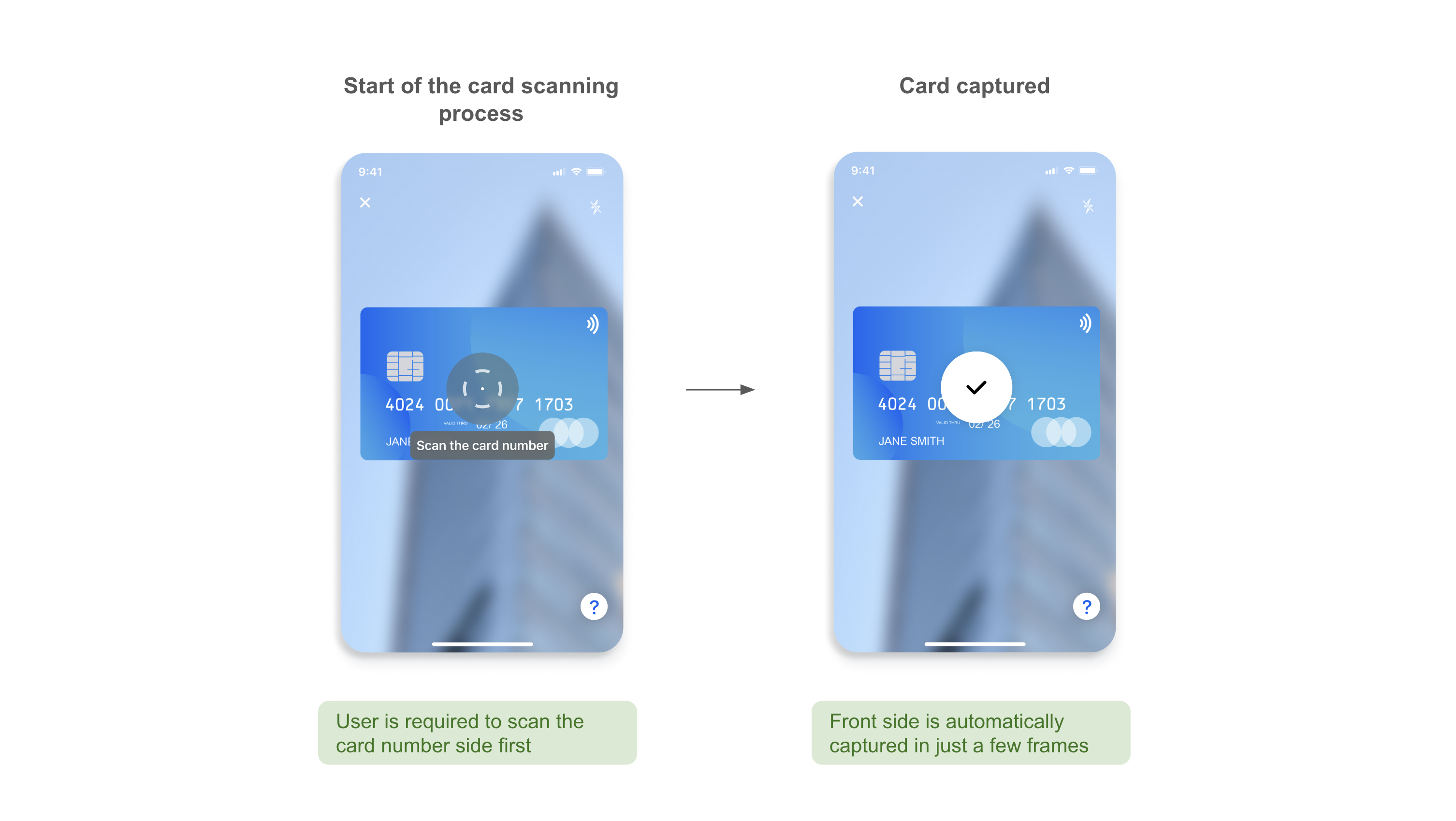
First side scanning process
The experience will always start with scanning the card number side of the payment card

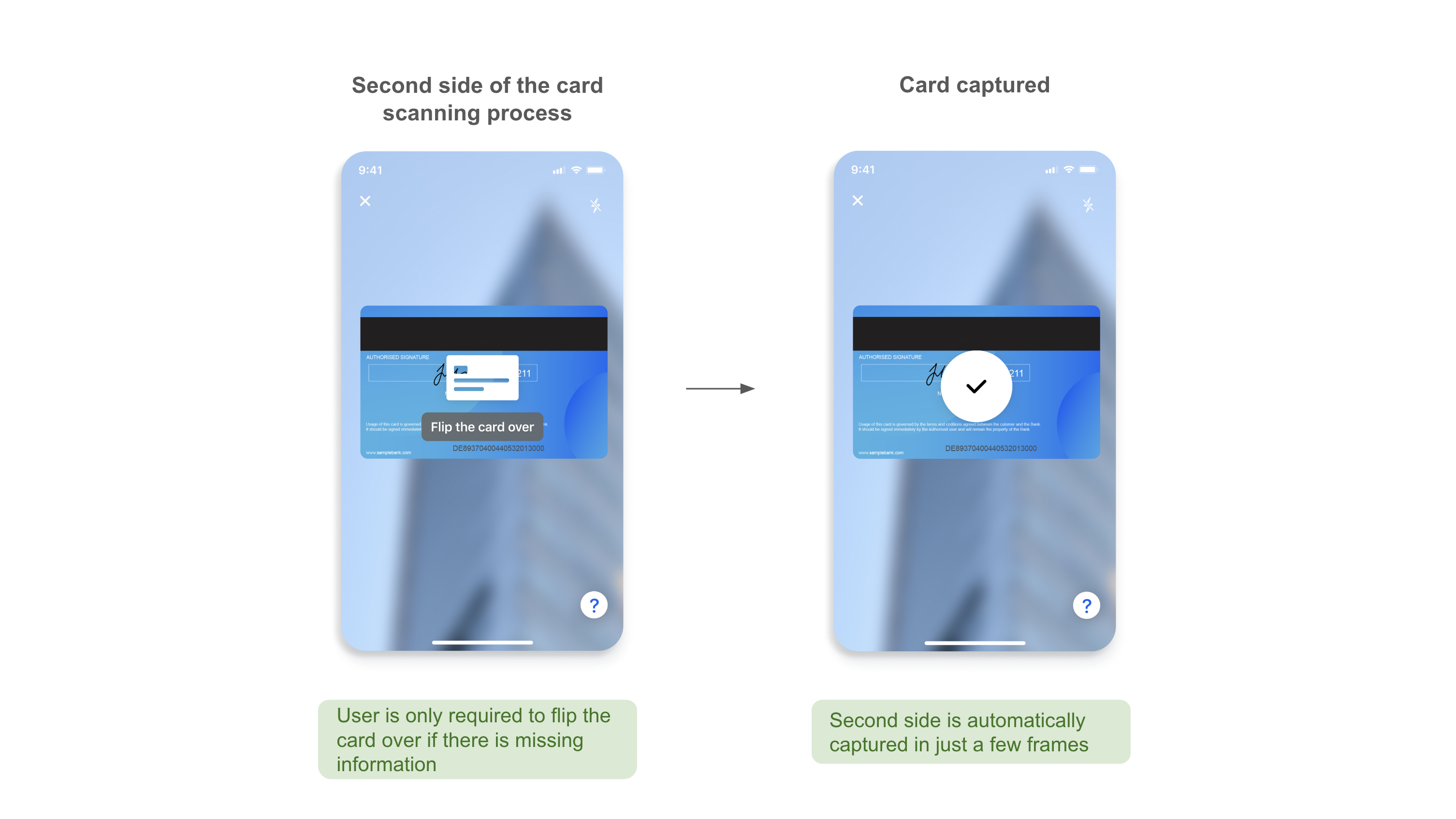
Second side scanning process
If additional information is still needed from the payment card, the user will be guided to flip their card over
