UX/UI best practices
Over the years, Microblink has teamed up with their partners to run dozens of tests, adding heaps of wisdom to our in-house team. Along the way, we've discovered some best practices that not only improve user experience but also give conversion rates a boost.
Getting to the camera screen
Ensuring a smooth transition to the SDK's camera screen is essential for the overall success of the integration. Here are some helpful tips to assist you in deciding how to make the transition to the scanning experience in our SDKs smoother and more user-friendly.
Make scanning a primary action
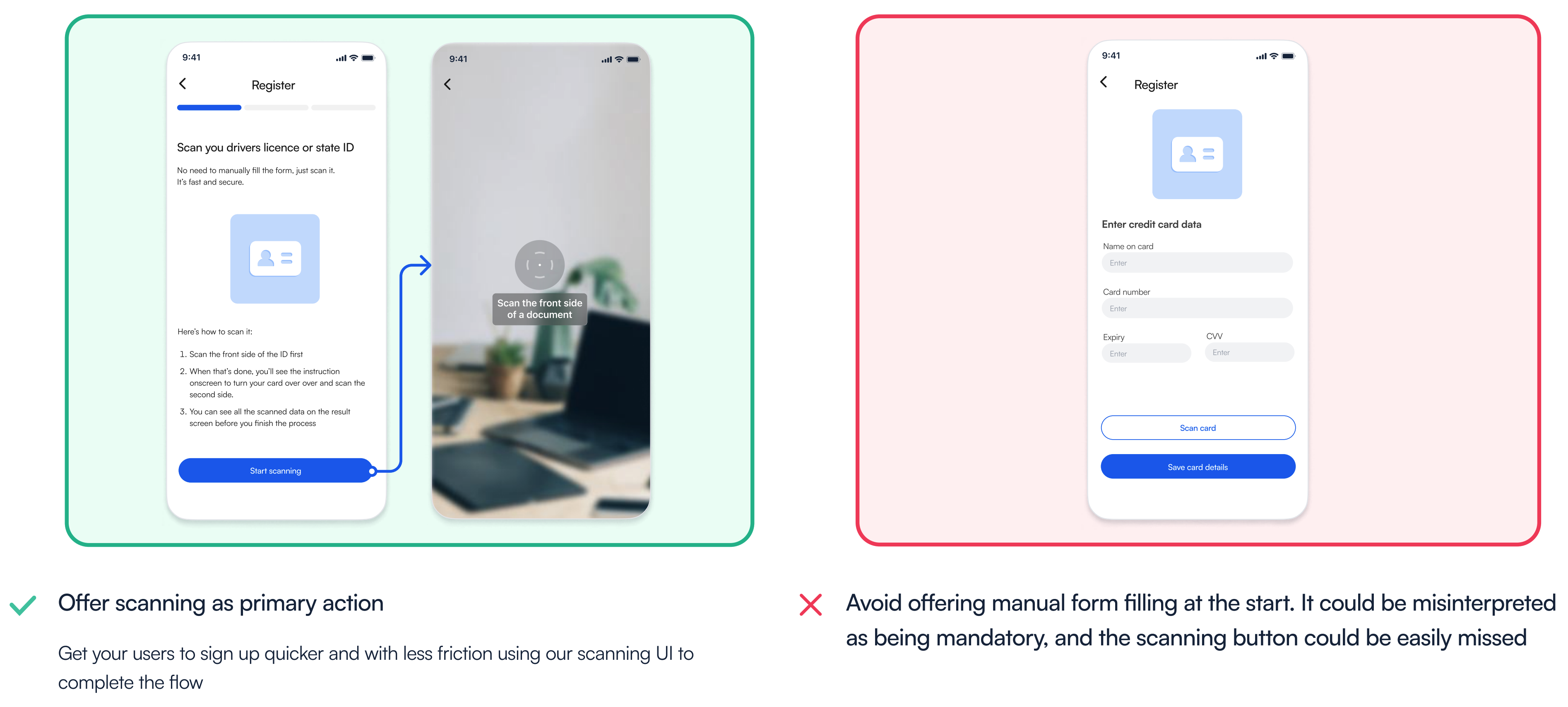
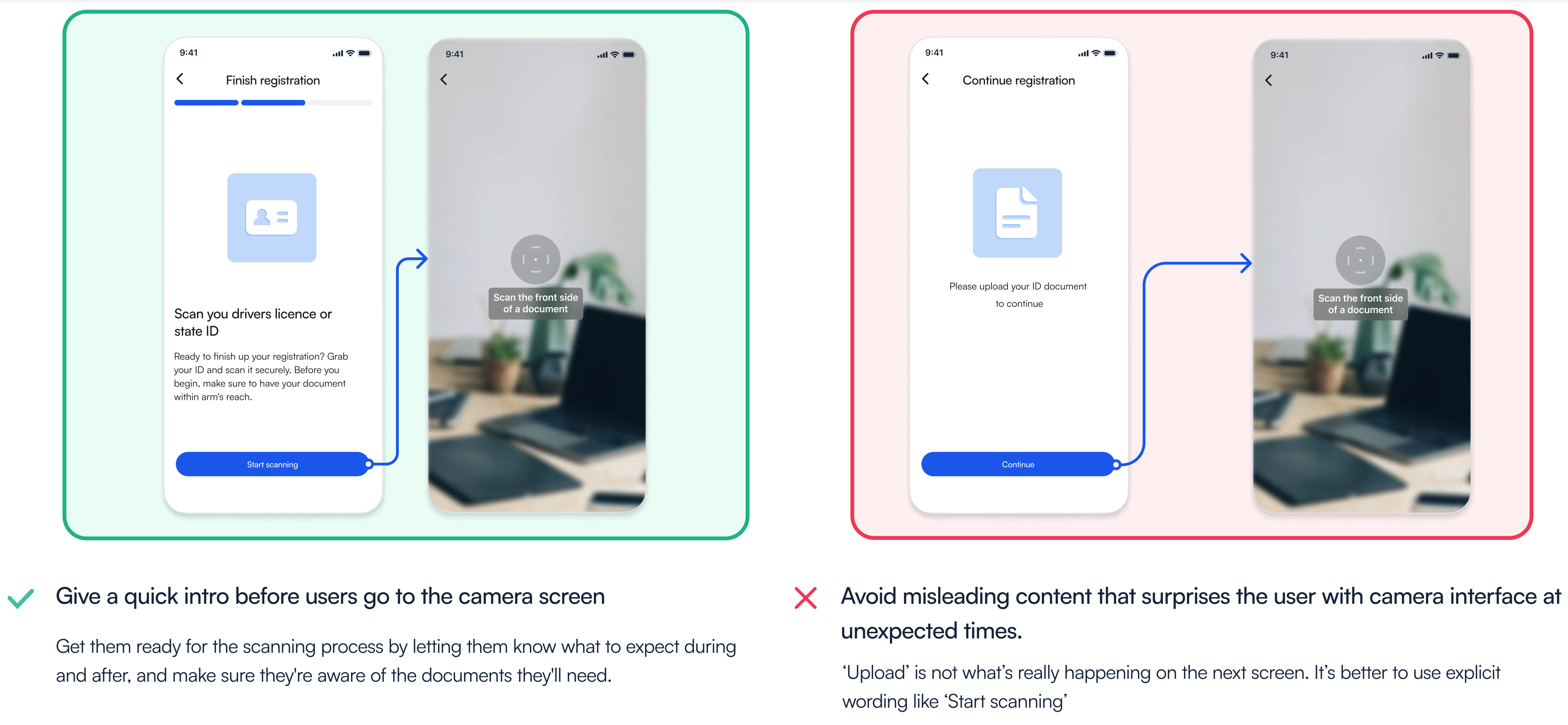
Prepare & reassure users
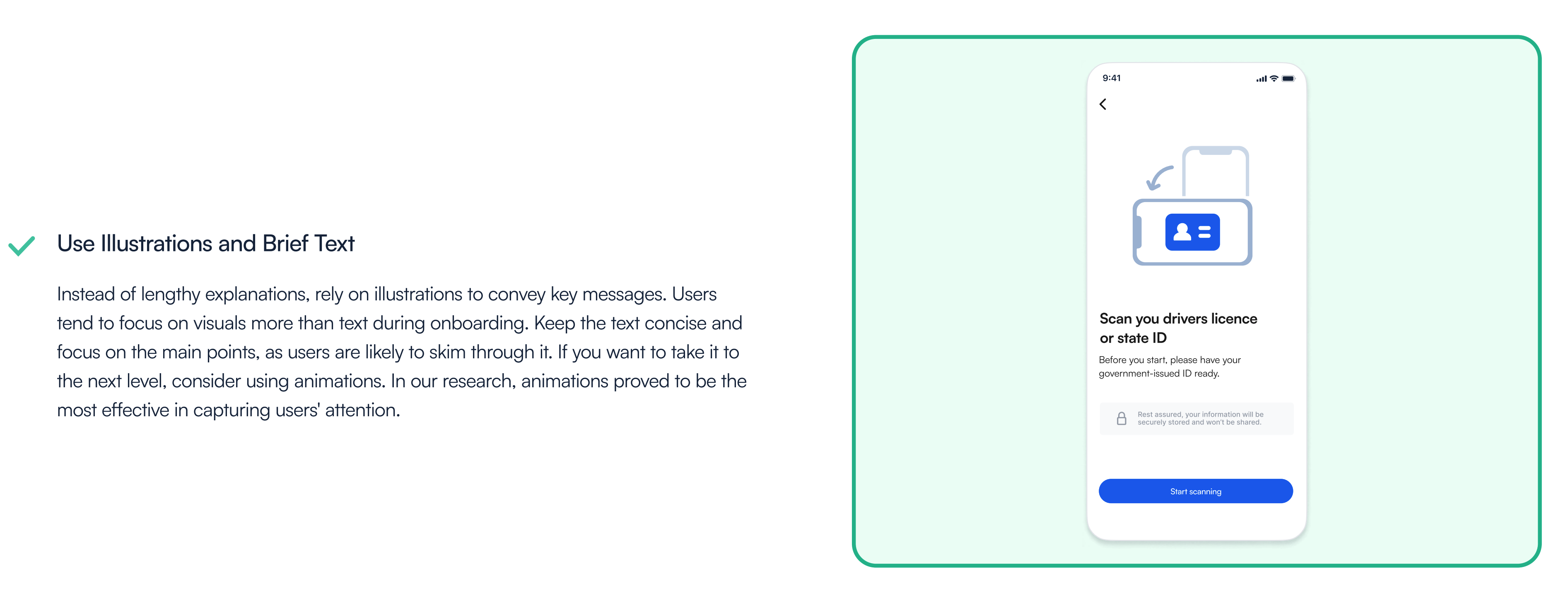
Scanning is a quicker and more user-friendly process compared to manual typing, but it's not something users do daily. Therefore, it's a good idea to provide users with a heads-up before they access the camera screen. This could be as simple as adding a text to the button or offering a quick onboarding guide explaining what to expect. Also, this gives users time to prepare the documents they need. Some user drop-off happens because users don’t have documents ready so they abandon the session and return once they are ready. Some of the users can be concerned about the data privacy and you taking a photo of their personal documents. This is a great place to reassure them about data privacy and inform them how their data will be used.
Clear call to action
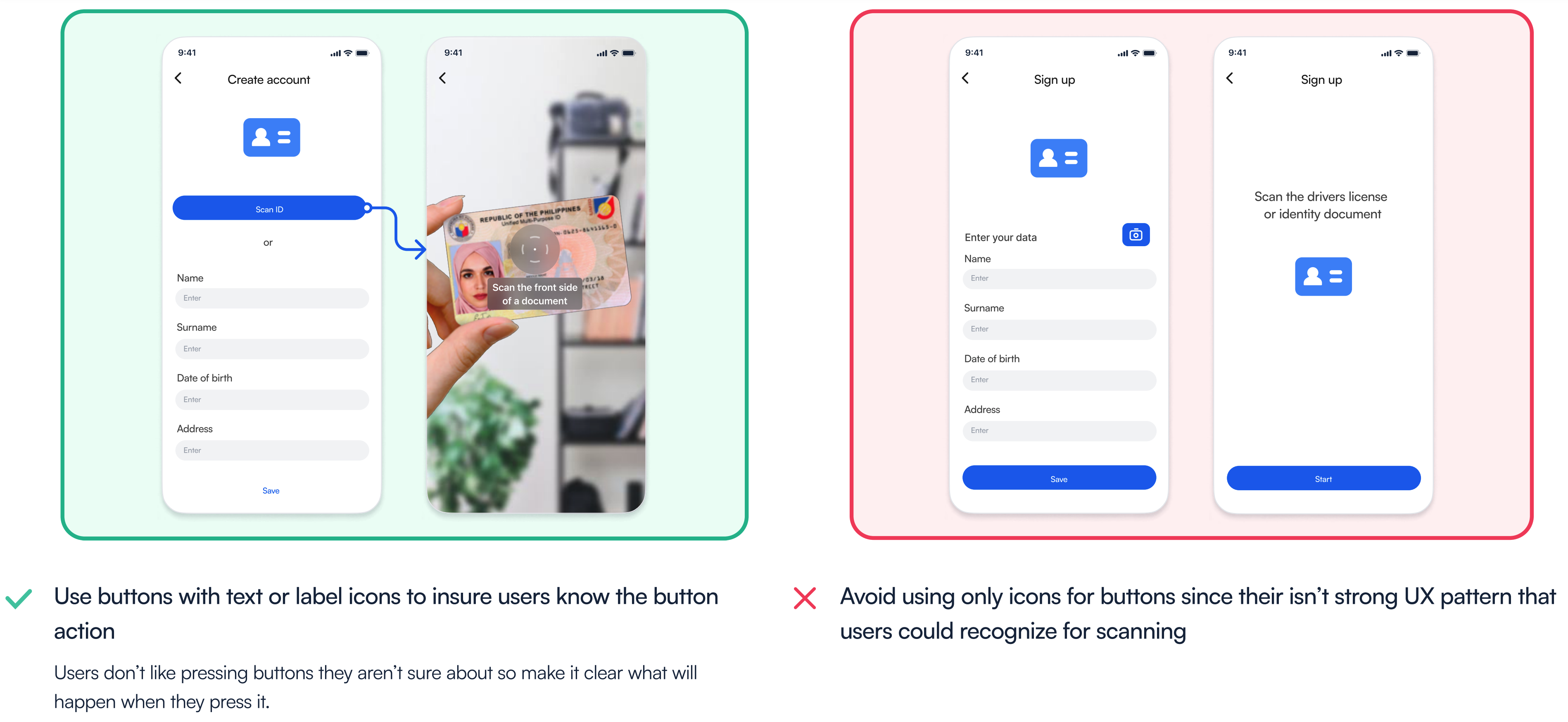
There isn't a universally recognized scanning icon that users can instantly understand. This means that when a button lacks a label or text, users are likely to be unsure about its function. This uncertainty can result in lower conversion rates, as users tend to avoid pressing buttons when they're uncertain about their purpose. Equally important is the text on the button. Using vague CTA like "Start" without providing detailed instructions may surprise users when the camera screen opens. It's crucial to make the button's purpose explicit and provide clear instructions on what will happen when users tap it.
Implementing scanning SDK
We have extensively user tested all of our SDKs to ensure the best possible experience for both you and your end users. While we recommend sticking with our out of the box UI/UX for the highest conversion rates, there are several ways to customize the SDK to seamlessly integrate it into your app. In this section, we will provide you with a few tips for achieving optimal results with our SDK.
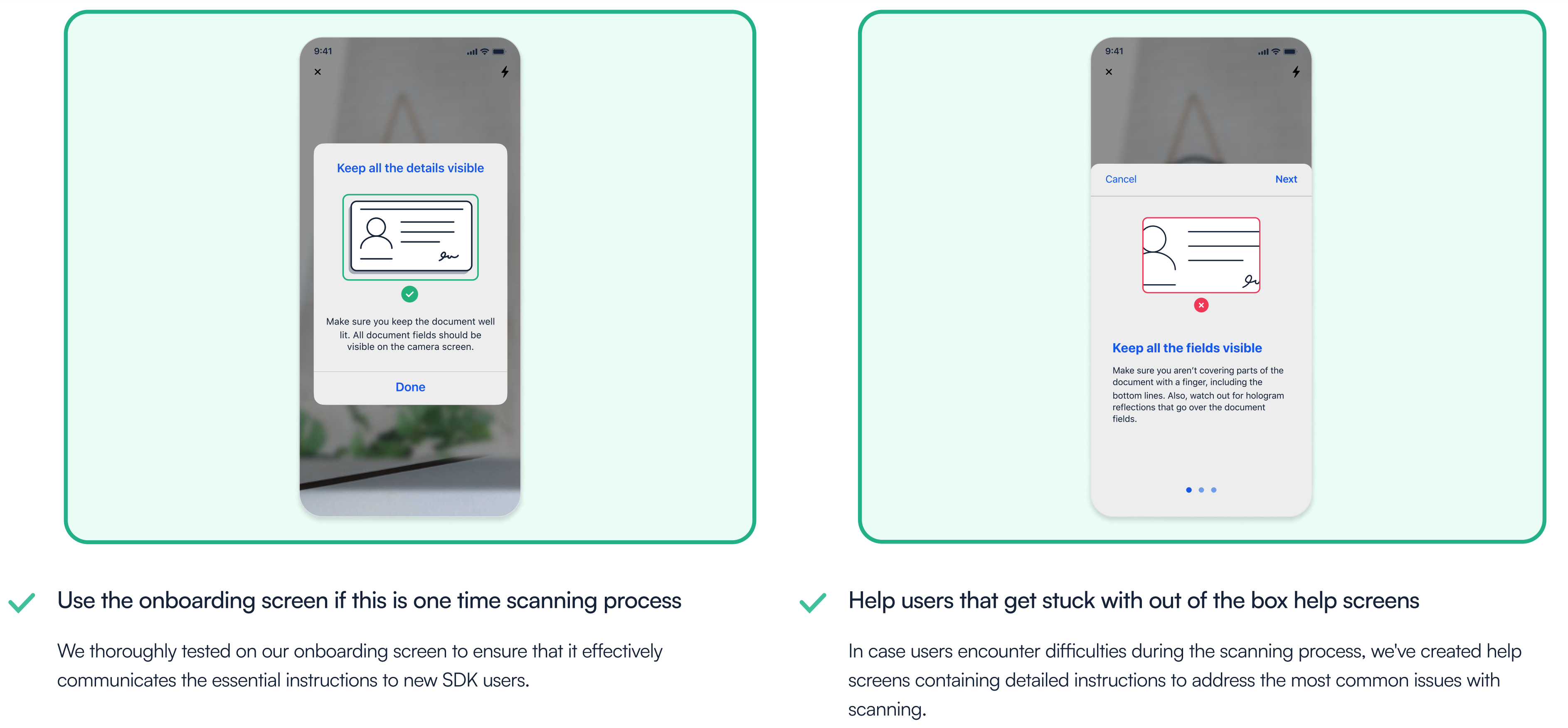
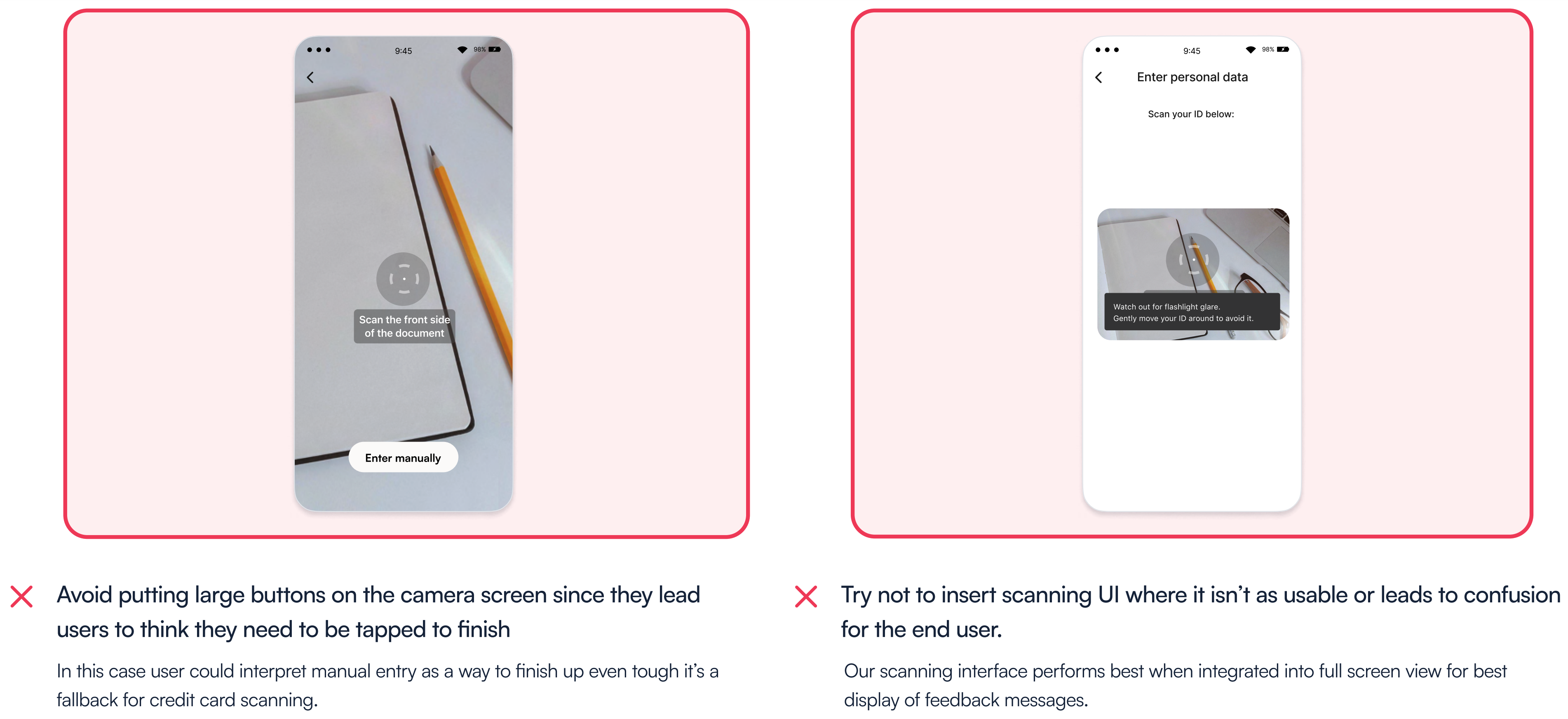
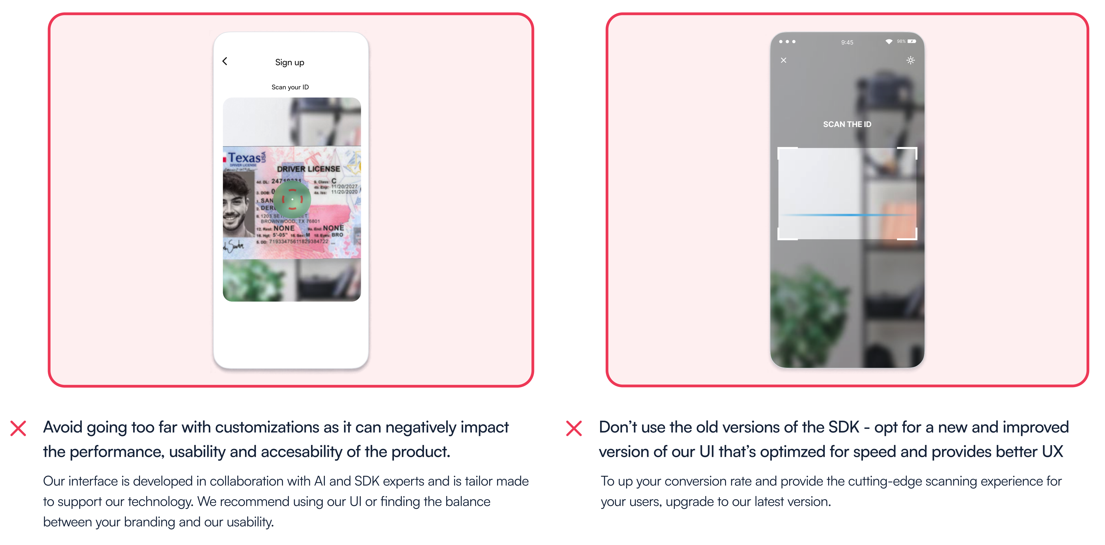
After the scan
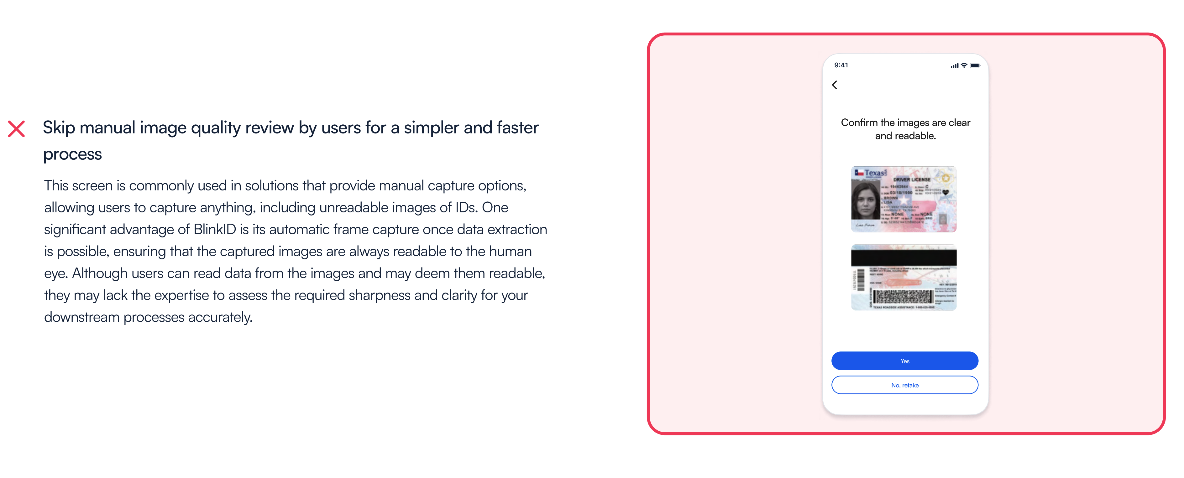
Our SDK is engineered to capture ID images when data can be reliably extracted from them. This means that the scanning process may conclude with successfully captured images, or it may time out if satisfactory images cannot be obtained. In such situations, there are several tips and tricks you can employ.
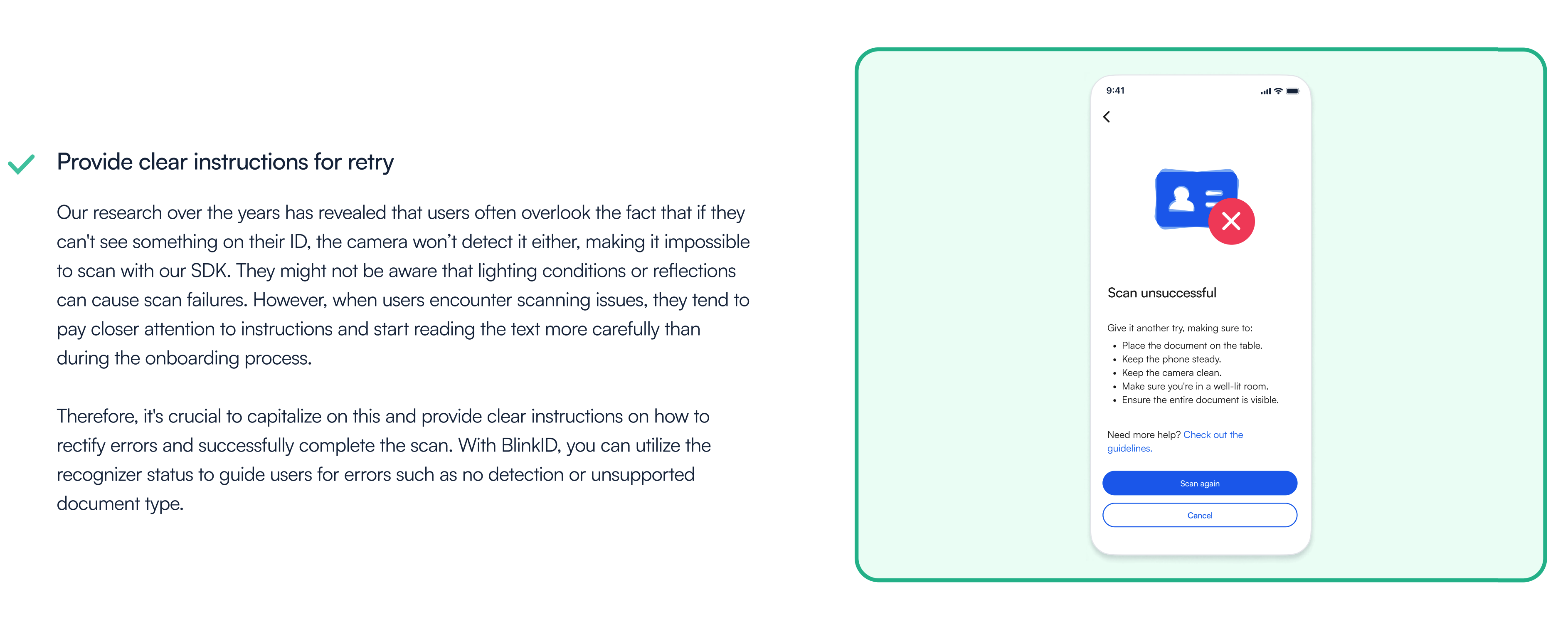
UX consultation service
Our in-house UX experts are the driving force behind exceptional user experiences. They have a profound understanding of user behavior, human-centered design principles, and industry best practices. With years of usability testing, they have gained insights into how end users interact with our products and how to tailor them to your specific use case. We encourage our clients to take full advantage of our dedicated UX experts' services. They are ready to provide expert guidance and support to ensure an exceptional user experience tailored to your specific needs.
Reach out to your account representative or contact us at sales@microblink.com to coordinate a UX consultation.