UX
The BlinkID SDK award winning user interface and experience are the result of extensive user testing and modern design principles. It's designed as a 0-input experience and optimized for first time success rates, boosting your accuracy and successful conversions.
0-input UX
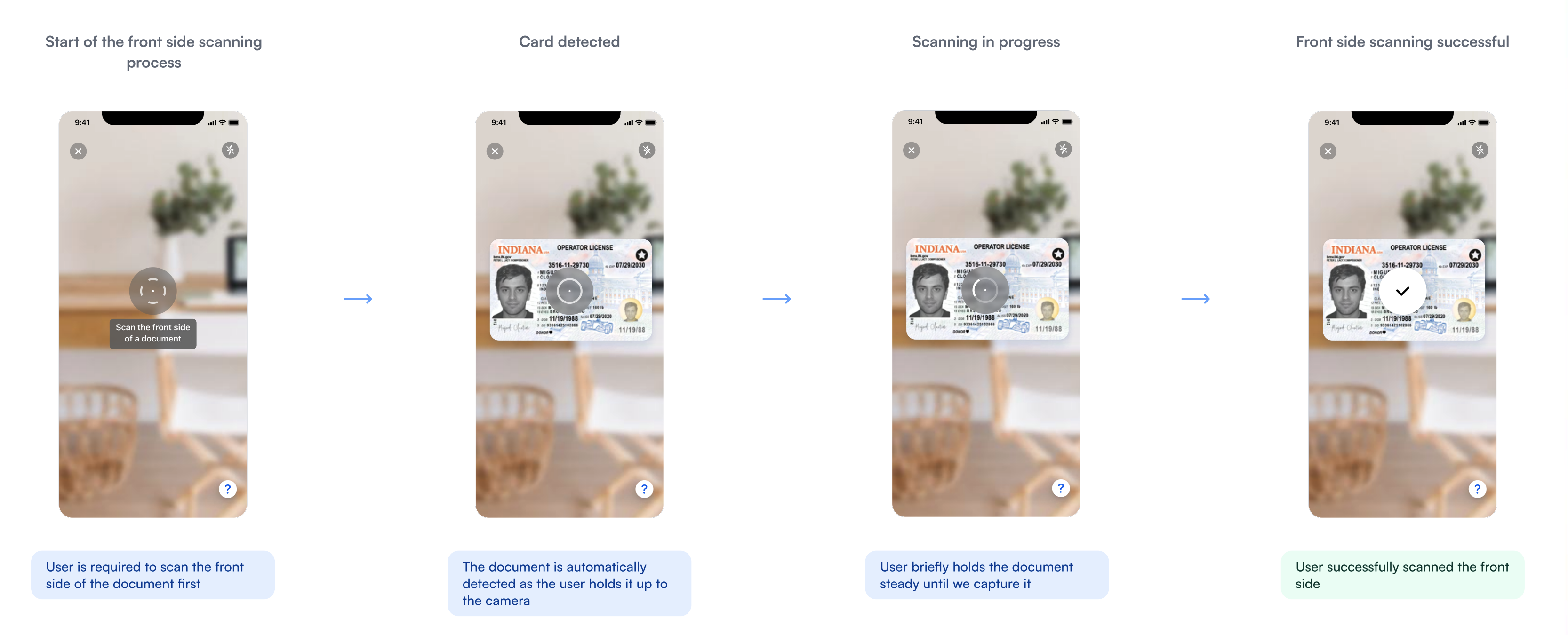
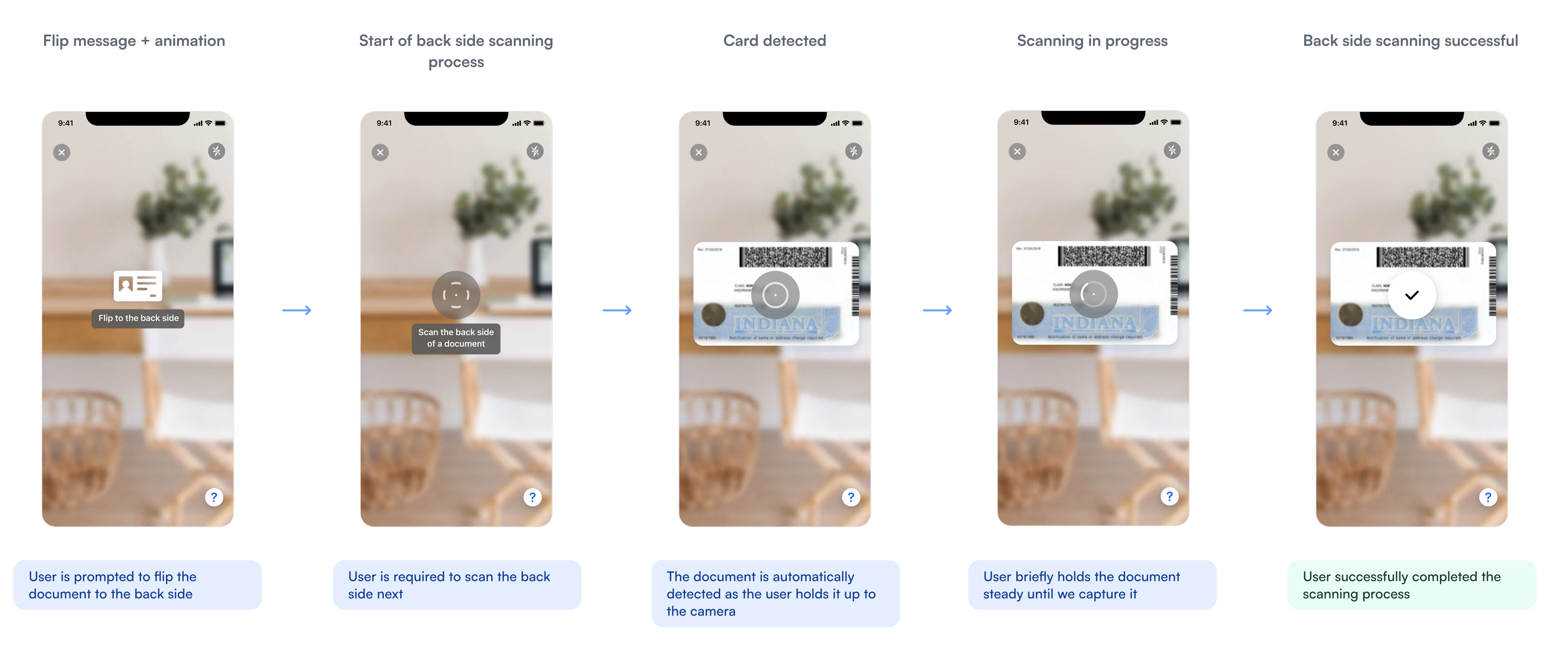
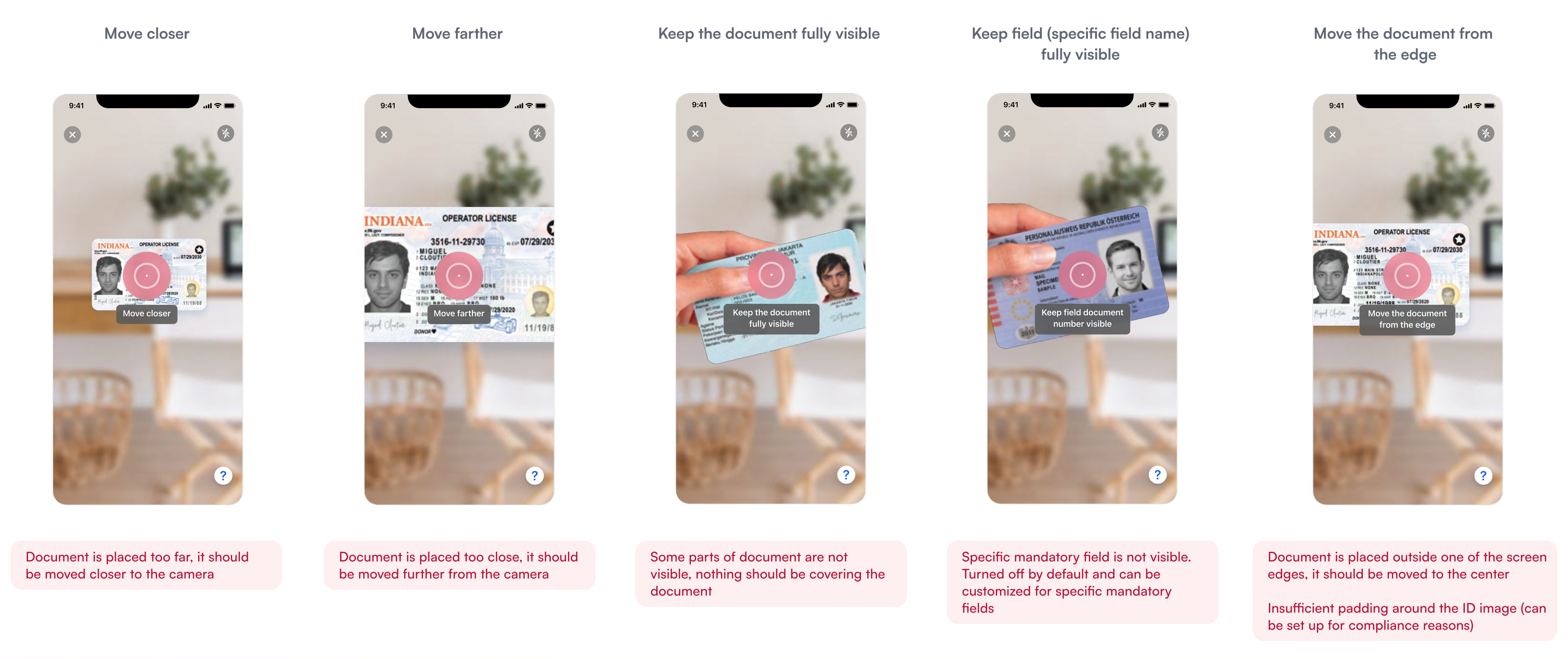
Your customers won't be required to preselect the type of document for scanning, won't need to frame their document in an outdated rectangular overlay, and won't need to QA their scan. Real time guided feedback based on client-side video analysis will get them through the process successfully with minimal friction.
Happy path
Front side scanning process
Back side scanning process
Errors and real time scanning feedback
Real-time feedback
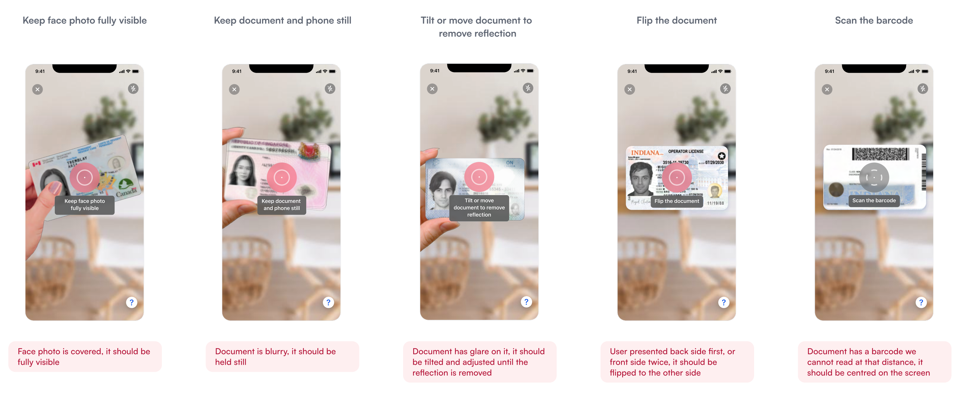
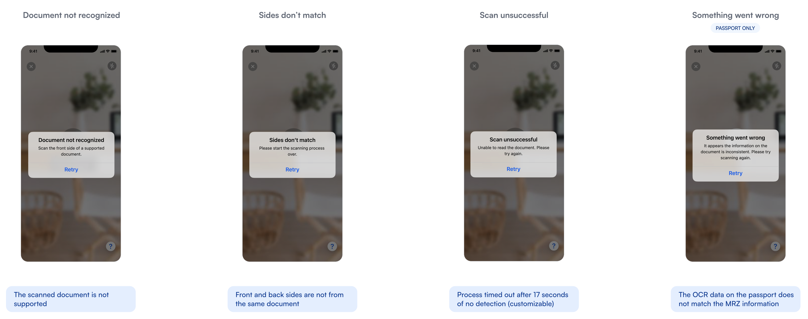
Alerts
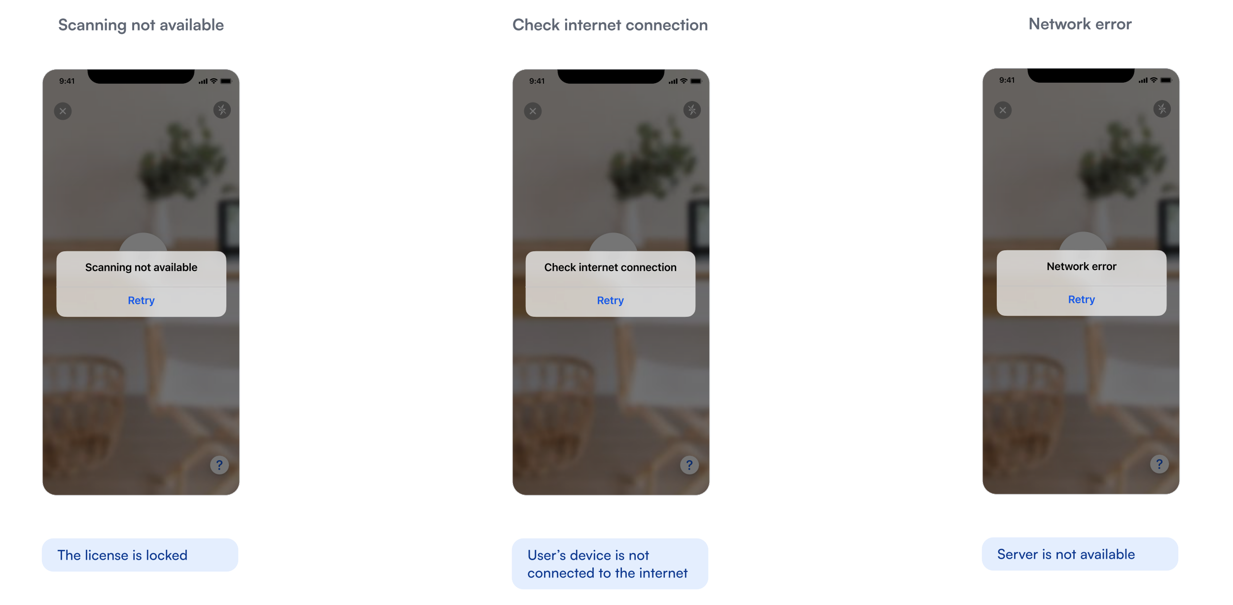
Remote lock alerts
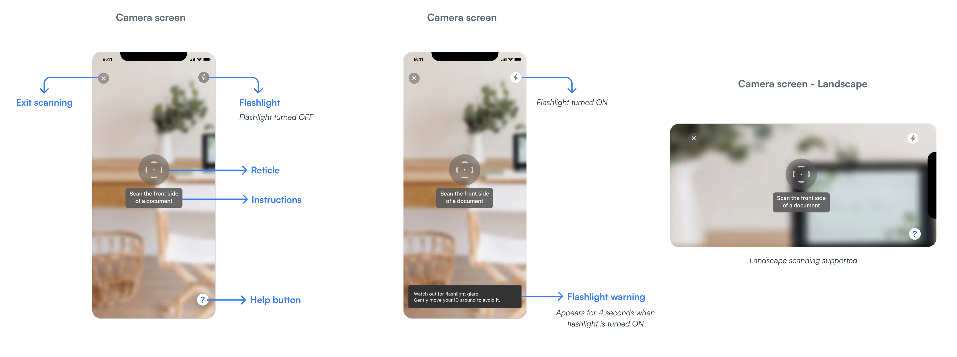
Camera screen elements
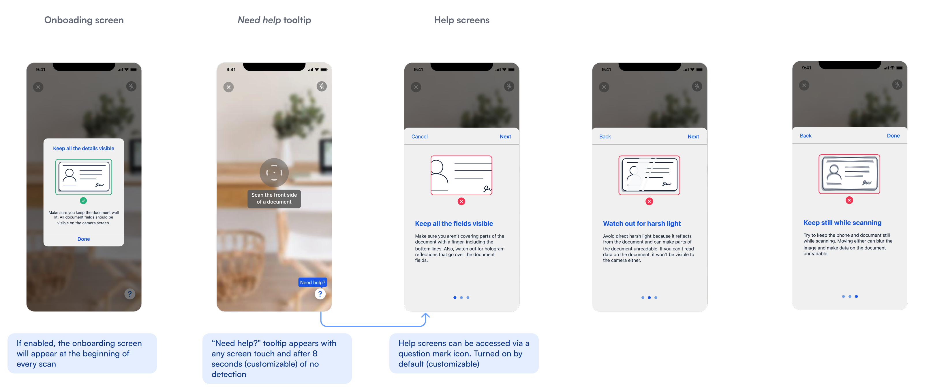
Onboarding and help screens
Platform specifics
While Microblink strives to ensure a consistent user-experience across all platforms, minor discrepancies may exist between web and mobile.